Process
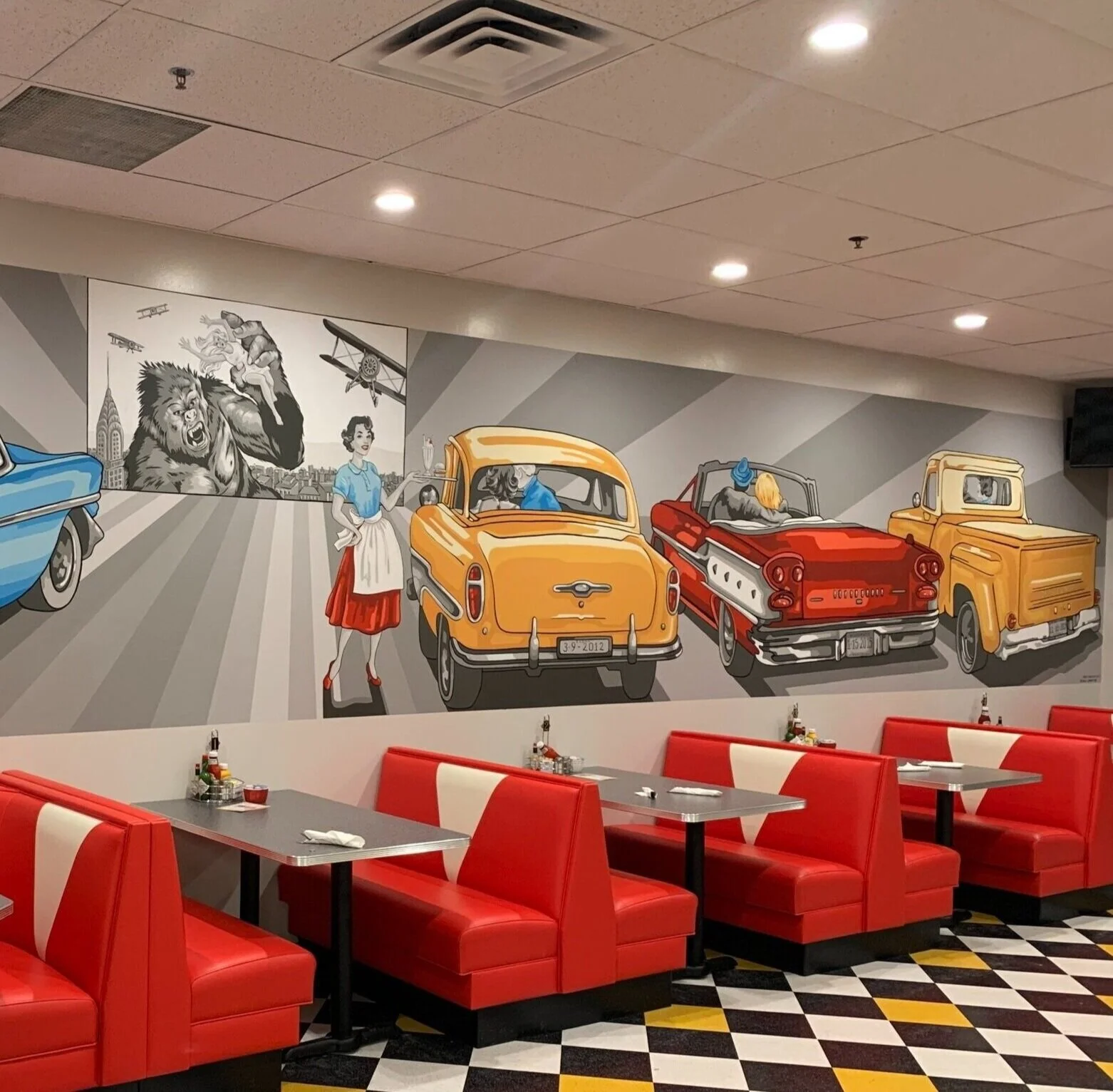
The clients at Ze’s Diner wanted this mural to capture the style of a classic 50’s diner. The space is vibrant, and we were able to incorporate details of this classic style while also including scenes from our client’s favorite 50s film.
Execution
I used the classic colors of yellow, red, and blue in a pop art style to bring this design to life. I used a neutral gray in the back to highlight the saturated colors of the cars and details from the era.
Detail
Finishing this mural, I incorporated the bold black outline to give it that 50s feel.


